Saturday 31 January 2015

Instax Research

To correspond with my demographic and the chilled atmosphere of the song I am considering using an Instax camera to take images with.


I will have to scan them in and they will be harder to manipulate on Photoshop but their becoming trendier due to their authenticity and no two images can be the same. Their popularity is being assisted by Taylor Swift's 1989 album which contains Polaroids. Taylor Swift is big in the genre singer/songwriter and therefore it is important that I keep up with trends to keep Matthew P current.


Below are some tutorials that I will be using to learn how to use the camera:


Different exposures:

I used different exposure levels on the same subject in a naturally light room. Below is how they turned out.


Instax 1: Inside Instax 2: Cloudy Instax 3: Sunny Instax 4: Very Sunny Instax 5: Hi-Key

I think the one that worked best was the Hi-Key, I really like the vibrant colours and I think this suits the nostalgic style. Although it does slightly overexpose certain areas but this 'bad quality' is quite fashionable as instant photos  The images 3 and 4 were too dark but this was more to do with light conditions rather than any other factor.

For these images to get on the blog I had to scan them which reduces the quality a little but the darker the image the more the bad quality shows up. Scanning is an effective way to reproduce them digitally.


Above I experimented with a scattered effect and I think this works really well. It would be improved if each of the images were of something different. It implies that more is there than what actually is therefore implying that the consumer is getting more for their money.


Above I also tried writing in the white spaces. This is done a lot on instant photos but here I feel it doesn't work. It distracts too much away from the image and there isn't enough room. For this reason I will exclude it from my ancillary products.


Matthew P - Long Straight Lines Research

On Top is from Matthew P's album Long Straight Lines. I will use this album for the basic information such as track list, record company and title. 

Long Straight Lines

Artist Name: Matthew P (presented in the form of his logo)
Title: Long Straight Lines
Price: £7.99 (correct at time of February 2015)
Track List and Number: 
1. On Top
2. Long Straight Lines
3. Hey Lady
4. Little You Little Me
5. Feet on the Ground
6. Long Way Home
7. Without the Sun
8. Gilly
9. I Miss You
10. Patti
11. End of the World
12. Wedding Song (acoustic demo [demo track])
Original Release Date: 1st May 2012
Record Label: YDNA Records
Record Label Logo: I currently can't find a logo for the record label so I will need to either contact the company or design my own.
Copyright: 2012 YDNA Records
Total Length: 40:53


Friday 23 January 2015

Photoshoot Planning

Prototype of Digipak


Digipak Flatplan

Above is my digipak flat plan. I have included lots of images to make it more visual and aesthetically pleasing. I have also stuck to certain conventions such as having the artist logo and title on the cover and track list on the back. I have also designed for the digipak to depict more information. For example I have added a pocket for a booklet that could contain more information such as lyrics or a commentary of what each song means from the artist.

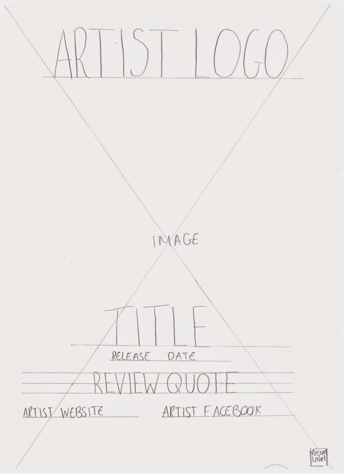
Magazine Advert Flatplan

I have gone for a simple design with as much information as possible due to my artist being an upcoming artist. I have highlighted quality, the release date, websites, social networking and all the necessary information so the viewer doesn't have to research anything. Due to the artist being unknown I can't rely on the viewer going to research on further details on the product.

Thursday 22 January 2015

Typography for Digipak


Above is 5 different fonts that I could possibly use for my ancillary products. I wanted the typography to match the title and contain 'long straight lines'. I find 1 and 4 are too overpowering which doesn't match the genre of soothing and soft. Number 2 is a default font and I find that the overproduction of this in other everyday media products means that it doesn't appear to be very professional. Number three is too much like a typewriter font and to me this has connotations of old and war-like whereas Matthew P is a new upcoming artist and the music gentle and relaxing. Font number five fits the description perfectly and I really like how it's spaced out making it clear and easy to read.

Motif's in my Music Video

For my ancillary products there needs to be a brand identity, so I investigated motif's in my music video that I could possibly bring into the ancillary products.


Wednesday 21 January 2015

Codes and Conventions of Album Magazine Adverts

To prepare me to make informed decisions during the creation of my advert I have explored the codes and conventions of  albums magazine adverts.

Sunday 18 January 2015

Digipak Analysis

Before designing my own digipak I explored different digipaks within the singer/songwriter genre to see the industry standard and to extend my knowledge of the product.

The Purposes of a Digipak

Above is a mind map of a digipak, I must ensure that I follow these to produce a successful digipak that's fit for its purpose.

Thursday 15 January 2015

Third Edit

Above is my third edit. After realising some parts of my second edit had sections that had sound from the original clips I removed them to establish the professional standard again. I also removed the effect of having two of the artist as the seam was visible and replacing it with a close up of the guitar being plucked to accentuate the genre of singer/songwriter which is strongly affiliated with this instrument.

Monday 12 January 2015

Second Edit


Above is my second edit. I have altered the points from my feedback and what I felt needed improving.